1,000 feet from the ridgeline
This vintage map shows the spot in northern Montgomery County, Md., where the Hawlings River tumbles out of a plateau and flows down a steep-sided, woodsy stream valley. There’s a lesson here about the boundaries between data and design, boundaries than are more fluid than they might seem.
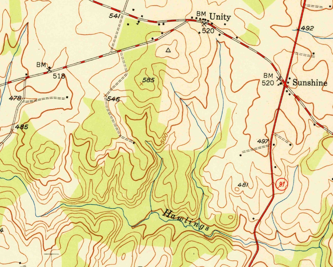
Detail from USGS Sandy Spring, Md. 1:24,000 topographic map, 1950 edition.
The area of this map is now Rachel Carson Conservation Park. I’ve run trails here, and the map doesn’t quite reflect ground truth. Look at the little reentrants to the north of the river (that is, the notches in the red lines above and to the left of the “Hawlings” label). Those reentrants each contain little brooks that flow at least intermittently, but those watercourses don’t appear on the map. The short stream at the center of the map continues farther uphill than the blue line on the map would suggest.
A surveying error? Possibly, but probably not.
The source map is a USGS 1:24,000 topographic map. This map series covered the whole of the lower 48 states, and the maps filled multiple semantic roles. Notably:
- They contained actual data, a record of what conditions on the ground were.
- They served as displays of those data that customers could read and use.
Show too many streams, and the map becomes cluttered and difficult to read. For this map series, USGS cartographers usually held to a density of about about 2.5 miles of stream for each square mile of map. Maintaining that density required choices about what features to show and to hide (cartographic generalization). USGS mapmakers, for the 1:24,000 quads, brought streams no closer than 1,000 feet to ridgelines, and did not map streams shorter than 2,000 feet.1
Under this policy, the rivulets of Rachel Carson Park disappear or lose their headwaters.
The problem is magnified in older map series, like 19th century topographic maps and nautical charts. Those maps were the product of a collaboration between the surveyor (who produced records in the field, often themselves highly legible maps), a cartographer (who worked back in the office, drawing maps from field data), and the engraver (who produced plates for printing the maps). Sometimes, the engravers had to change features on the maps because the lines would not fit on the plates.2
In the 1990s and 2000s, the 1:24,000 series topo quads became the source for the USGS National Hydrography Dataset (NHD), a digital representation of the country’s water features. In some areas, the 1,000 foot rule stands, although elsewhere, other agencies have mapped additional streams at a higher density.
We might not appreciate this close relationship today, with ready access to national datasets and the spread of data tiles that push features down to mobile mapping apps. These choices stay with us, though, in more hidden forms. Last I checked, Mapbox removes hydrographic features at small-scale zoom levels. You can’t map a stream, zoomed out, even if you want to.
Over the next decade, American hydrography data will lose this connection to map design choices. Earlier this fall, the USGS ceased maintaining the NHD and announced work on a replacement dataset, through the 3D Hydrography Program, which will draw from additional and more precise data sources, including high-resolution elevation models.
-
Simley, Jeff. GIS for Surface Water: Using the National Hydrography Dataset. Redlands, Calif.: Esri Press, 2018. ↩
-
Grossinger, Robin M., Ruth A. Askevold, and Joshua N. Collins. T-Sheet User Guide: Application of the Historical U.S. Coast Survey Maps to Environmental Management in the San Francisco Bay Area (SFEI Report No. 427). Oakland, Calif.: San Francisco Estuary Institute, 2005. ↩